In traditional responsive design, we rely on media queries to change styles based on the overall viewport size. This works well for adjusting layouts for different screen sizes, but it falls short when you need components to adapt based on their container’s size.
To solve this situation, Container Queries were introduced in CSS. They allow you to apply styles to elements based on the dimensions of their containing block, giving you more granular control over responsive design.
Let’s say we have a Card component, containing an image, title, and a few paragraphs. The Card has two layout modes: horizontal for large screens and vertical for smaller screens.
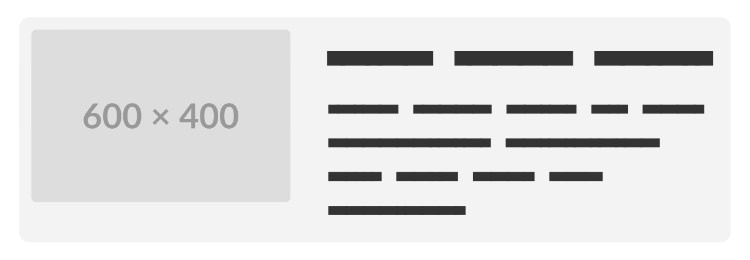
In the horizontal mode, the image will be on the left, and the title and paragraphs are on the right.
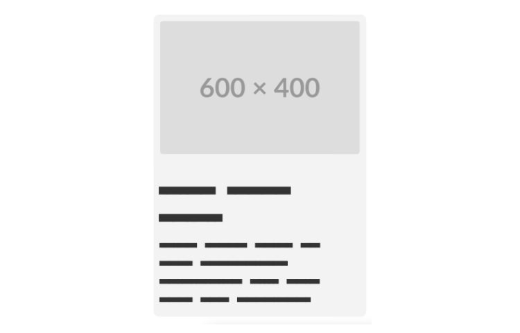
In the vertical mode, the image is on top, and the title and paragraphs are below it.
We want this Card to switch between these two modes. Traditionally, we would wrap the styles around the @media query, for example:
.card {
    display: flex;
    gap: 4rem;
}
.card .featured-img {
    width: 40%;
}
.card .content {
    width: 60%;
}

@media screen and (width <= 720px) {
    .card {
      flex-direction: column;
    }

    .card .featured-img {
      width: 100%;
    }

    .card .content {
      width: 100%;
    }
}
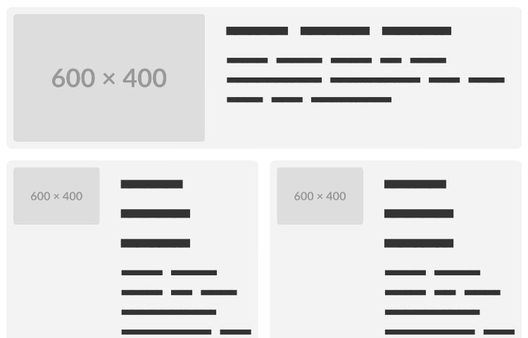
The problem here is that Media Queries only account for the viewport size, not the container size. If the Card is placed inside a container with a width of 500px, the Card will still be in the horizontal mode, even though it’s not suitable for the container size. We may end up with the content and the image being squished, or the image overflowing the container.
This is one example where Container Queries can be useful. With Container Queries, we can apply styles based on the container’s size, instead of just the viewport size.
To use them, we will need to wrap our .card with a new container. In this example, we will name it .card-container. Then we can add it with the container-type: inline-size declaration.
.card-container {
    container-type: inline-size;
    width: 100%;
}
The inline-size value specifically enables querying the inline dimension, usually the width in horizontal writing modes of a container.
When we set container-type: inline-size on an element, we’re essentially telling the browser to treat that element as a container whose width can be queried using Container Queries. This is required for applying styles based on the size of the container, rather than the viewport. The width is also important to ensure the container takes up the full width of its parent.
Now, we can apply the styles based on the container’s size in addition to the Media Queries:
@container (max-width: 720px) {
    .card {
        flex-direction: column;
    }

    .card .featured-img {
        width: 100%;
    }

    .card .content {
        width: 100%;
    }
}
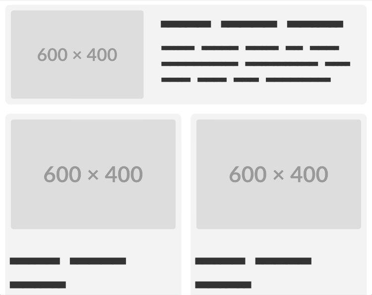
The two cards from our example should now switch to the vertical layout when the container’s width is less than 720px, regardless of the current viewport size.
Browser Compatibility
| Browser | Desktop Version | Mobile Version |
|---|---|---|
| Google Chrome | 105 and later | 105 and later |
| Mozilla Firefox | 109 and later | 109 and later |
| Safari | 16.4 and later | 16.4 and later |
| Microsoft Edge | 105 and later | 105 and later |
| Opera | 91 and later | 91 and later |
| Internet Explorer | Not supported | Not supported |
| Samsung Internet | N/A | 20.0 and later |
Inspirations
We’ve walked through a very common use case of using Container Queries. We can actually do so much more with them to create more innovative features on our website, such as combining them with animations, interactive elements, and more. Here are some demos of using Container Queries for your inspiration.
CSS Container Query House
You can resize the container size vertically or horizontally and see the house expand with more rooms and windows.
See the Pen CSS Container Query House by Arco (@Lumocra) on CodePen.
See the Pen Responsive House with CSS Container Query by Gayane Gasparyan (@gayane-gasparyan) on CodePen.
Squish CSS Container Queries
Click the button Add Squishy to add more squishies inside the block and see how their reaction changes the more you add as there isn’t enough room inside.
See the Pen CSS Container Queries by Max Swann (@maxcswann) on CodePen.
The post CSS Container Queries appeared first on Hongkiat.

